Huy Tran

I completed my Masters in Data Science from College of Computing & Digital Media, DePaul University by the end of 2019.
I am working as a Senior Research Analyst at Ipsos, doing market research work with clients in Energy, Mobile Communications, and Pharmacy Convenient Stores to assist in understanding their branding and product launches.
Multivariate Temperature Forecasting Using RNN/LSTM
Project description: The problem is a multivariate forecasting problem. Given a historical data of climate conditions, we need to predict the temperature of the next hour based on the climate conditions and temperature over the last 24 hours.
1. The Data
There are two data files, one for training and one for testing.
The training dataset has 52,566 instances, across 14 variables, excluding datetime. Each instance has 14 measurements, among which ‘T (degC)’ is the target variable that I need to build a prediction model for. Additionally, the instances represent 14 weather measurements of every consecutive hour (1AM to 12AM), which indicates that this is a time-series data. The test dataset consists of 17,447 instances.
Unlike training set, test set has 336 columns, which is an aggregation of the 14 climate measurements across a period of 24 hours (a day). In other words, each test instance has a day worth of data. The test dataset was provided in such format so that it is ready for Keras Recurrent Network Model once it is ready to make predictions.
2. Basic exploratory data analysis
From the multivariate line chart (Multi-variables line chart), the first observation that stands out is the majority of climate measurements, except for ‘wv’, ‘maxwv’, and ‘wd’, have some rhythm or pattern over time.
# specify columns to plot
fts = [0, 1, 2, 3, 4, 5, 6, 7, 8, 9, 10, 11, 12, 13]
i = 1

# plot each column
pyplot.figure()
for ft in fts:
    pyplot.subplot(len(fts), 1, i)
    pyplot.plot(values[:, ft])
    pyplot.title(data_train.columns[ft], y=0.5, loc='right')
    i += 1
    pyplot.tick_params(axis='both', which='major', labelsize=8)
    pyplot.suptitle('Multi-variables line chart')

pyplot.show()
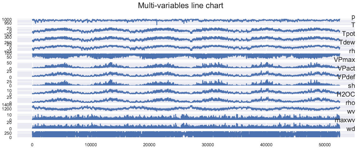
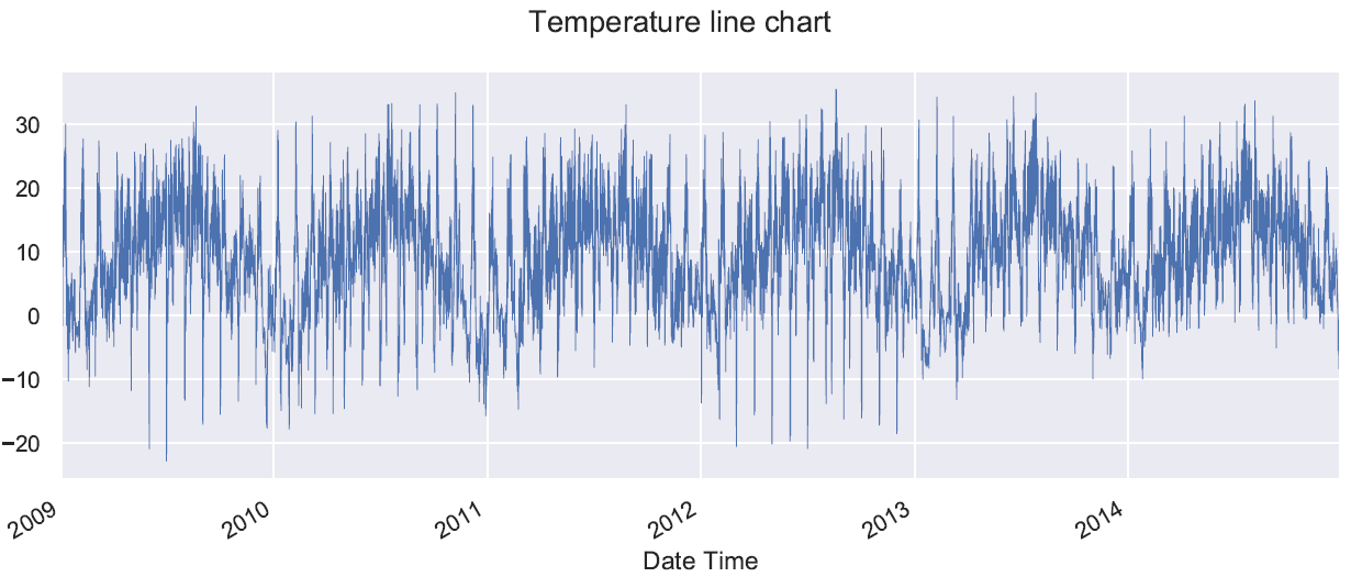
Line chart of variable T (Temperature line chart) demonstrates an annual pattern. It is worth noting that there are sets of variables that appear to have very similar pattern, such as: T -Tpot-Tdew; VPmax-VPact-VPdef; H2OC-rho. Could this be a signal that these variable sets indicate correlations?
# line graph of T (degC) of training set
data_train['T'].plot(linewidth=0.5)
pyplot.suptitle('Temperature line chart')
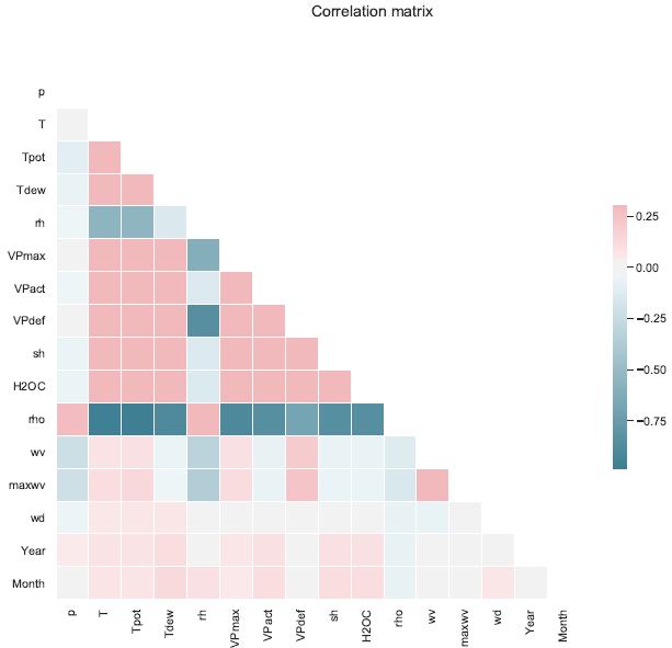
The correlation matrix (Correlation matrix) shows no strong positive correlation (the strongest is indicated by the color reddish pink, which is slightly higher than 0.25). However, there are candidates of reasonably high negative correlations (the strongest is indicated by the color dark blue, which is about -0.9). It appears that variable ‘rho’ has strong negative correlations with various variables, among those are T-Tpot-Tdew, and VPmax-VPact-VPdef.
sns.set(style="white")

# Compute the correlation matrix
corr = data_train.corr()

# Generate a mask for the upper triangle
mask = np.zeros_like(corr, dtype=np.bool)
mask[np.triu_indices_from(mask)] = True

# Set up the matplotlib figure
f, ax = pyplot.subplots(figsize=(11, 9))

# Generate a custom diverging colormap
cmap = sns.diverging_palette(220, 10, as_cmap=True)

# Draw the heatmap with the mask and correct aspect ratio
sns.heatmap(corr, mask=mask, cmap=cmap, vmax=.3, center=0, square=True, linewidths=.5, cbar_kws={"shrink": .5})
pyplot.suptitle('Correlation matrix')
3. Data pre-processing
In order to utilize Keras recurrent network models such as RNN, LSTM (Long-short term memory) or GRU (Gated recurrent unit), training set needs to be re-framed so that it is compatible with these recurrent net algorithms. I borrowed the function from here, which helps return reframed time series as a supervised learning dataset. The function takes as input the following parameters: the dataset, number of lag observations as input, number of observations as output, and whether to drop rows with NaN values. For the purpose of this project, the number of lag observations as input would be 24, as I want to predict the temperature by using data from the previous 24-hour window. Consequently, the number of observations as output for desired model is 1, in other words the temperature of the 25th hour.
Training dataset was first normalized. There are two types of normalization that I have experimented with using sklearn.preprocessing, which are MinMaxScaler and StandardScaler. The majority of the models trained had data normalized using Standard normalization. Additionally, in regards to training set, the order in which normalization and separation of training input and output was also experimented with. In other words, output used to train the models (ytrain) would either be normalized or not normalized. If normalization is not applied to ytrain, rescaling the predictions after calling model.predict() on test dataset won’t be performed. Based on results from fitting models trains, it appears that the models return better predictions if normalization applied.
# normalize features BEFORE separate input and output of train/validation set
if ft_norm == 0:
    scaler = MinMaxScaler(feature_range=(0, 1))
    normalized_train = scaler.fit_transform(data_train)
    print('MinMax Normalization Applied')

if ft_norm == 1:
    scaler = StandardScaler()
    normalized_train = scaler.fit_transform(data_train)
    print('Standard Normalization Applied')
After using the function (mentioned earlier) to reframe training set to have 1 output (prediction) for every 24 timesteps, the resulted data frame has size (52542 x 350). This is because the function returns the prediction for all 14 variables, but I only need the final predictions of temperature. Thus, I would remove the 13 columns of the other climate measurements. Our updated data frame now has a shape of size (52542 x 337), and from here the input and output can be separated. Before separating the training input and output data, a split of proportions 80/20 was applied, so that a validation set it saved aside. It is important to note, since the order of the instances is crucial due to the nature of time-series data, Pandas function loc[] was utilized to split the data 80/20 into training and validation sets. Finally, function reshape() was used for all input datasets (training, validation, and test), so that the input would have Keras-ready format as following: (samples, timesteps, features/dimensions). These are the final shapes of the input sets for training, validation and test, respectively: (42012, 24, 14), (10530, 24, 14), and, (17447, 24, 14).
# using series_to_supervised(), frame as supervised learning, with 24-hour timesteps
reframed_train = series_to_supervised(normalized_train, 24, 1)
reframed_train.shape
4. Final chosen model
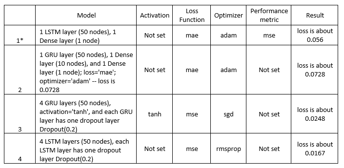
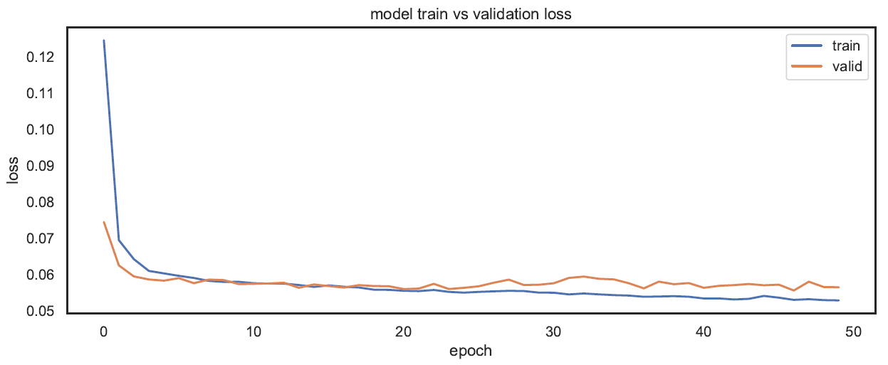
The first model that I trained turned out to be my best model. In terms of complexity, it was the simplest model of all the models that were experimented with. In terms of structure, this model has one layer of LSTM with 50 nodes, and the input_shape parameter was set to match the shape of the input from training set, which is (24, 14). The output layer is a Fully Connected layer, with 1 node, as we want one output for each instance. The model.compile() has three parameters passed into: Mean Absolute Error (mae) as loss function, optimizer (adam), and Mean Squared Error as performance metrics. Total trainable parameters are 13051. When calling model.fit() with training set, besides input (xtrain) and output (ytrain), there are 4 main parameters passed into: number of epochs (50), batch size (30), shuffle set to False as we don’t want the input to be randomized, and validation input (xvalid) and output (yvalid). Initially, my model performed well during the Kaggle competition, in terms of ranking. However, during the early week of submission, submitted models appeared to perform not as well as the professor’s sample model. This signaled that my model was actually not performing well. One important clue that line graph of ‘train vs validation loss’ (below) demonstrates is that there is a possibility of overfitting, as after 15 epochs, validation set starts to have higher losses than training set. In other words, during the 50 epochs of training the model, as error from training set is decreasing, error from validation set is increasing. As I experimented with other models, this model still had the highest score, thus I chose this as the final submission model.
# plot history of loss for train and valid sets
pyplot.plot(history.history['loss'], label='train')
pyplot.plot(history.history['val_loss'], label='valid')
pyplot.title('model train vs validation loss')
pyplot.ylabel('loss')
pyplot.xlabel('epoch')
pyplot.legend()
pyplot.show()
5. Other models experimented
Below are some of the model structures that I experimented with. Some of them have small loss values, however when I submitted to Kaggle competition, they didn’t do as well as my original model. For all the additional models, I also use the same parameters with model.fit()